2026 Color Trends – Balance, Calm and Personal Expression
Interior design trends for 2026 move toward a more thoughtful and balanced use of color. Instead of bold, short-lived statements, the focus is on palettes that feel calm, personal and designed to last. Color is used with intention, supporting the atmosphere of a room rather than dominating it.
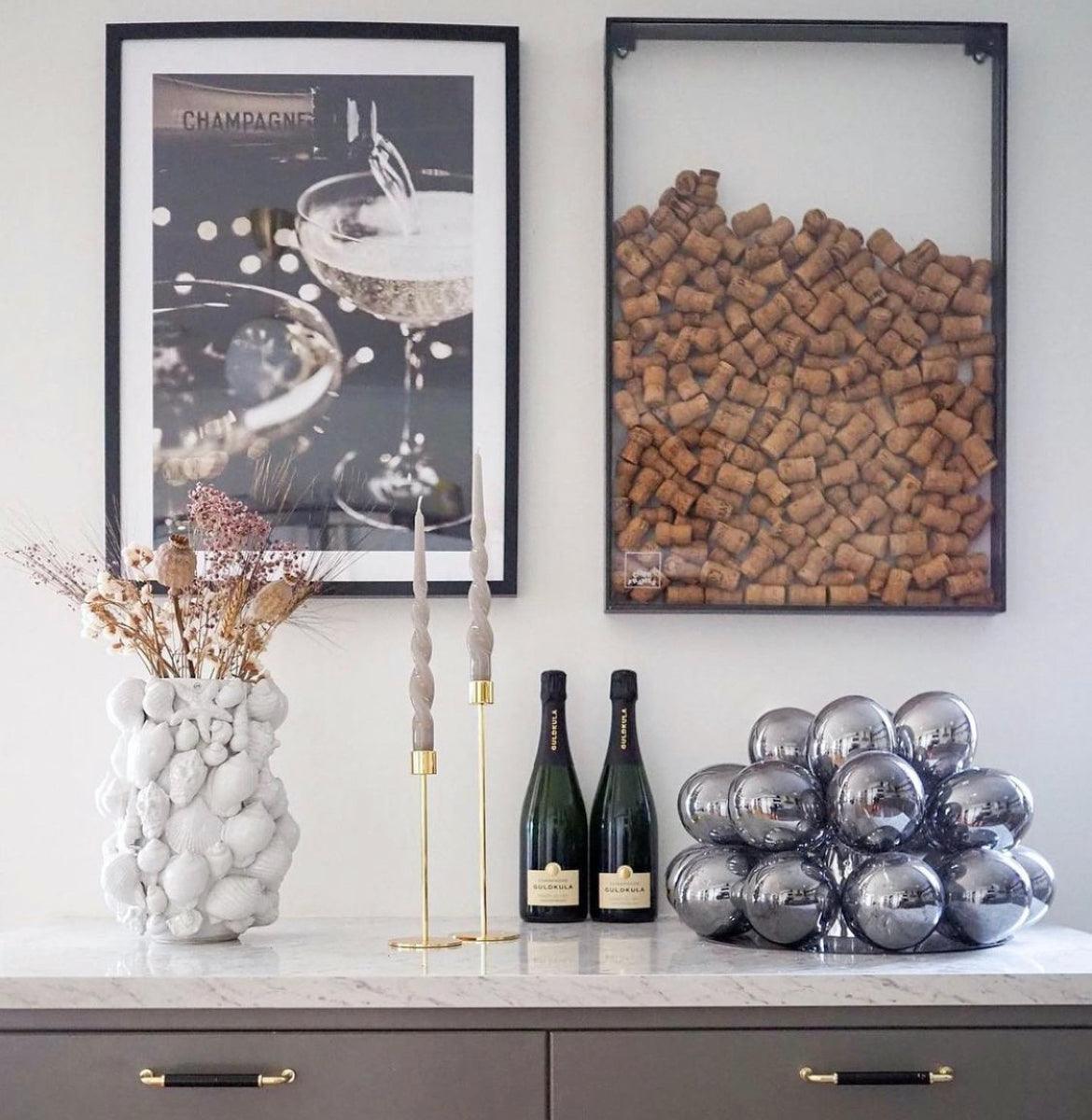
Light and warm neutrals continue to form the foundation of many interiors. These tones create openness and provide a timeless backdrop for furniture, materials and art. At the same time, accent colors become more defined, often introduced through details rather than large surfaces.
Blue as a Key Color for 2026
Blue stands out as one of the most important colors for 2026. The spectrum ranges from soft, muted blues to deeper and more saturated shades. Blue adds calm, clarity and visual depth, making it a natural choice for modern interiors.
This color pairs easily with light neutrals, natural materials and soft textures. Used in the right balance, blue brings character without feeling heavy, creating interiors that feel both contemporary and relaxed.
Earthy Tones and Soft Pastels
Alongside blue, earthy tones remain an important part of the 2026 palette. Shades inspired by sand, stone and warm neutrals contribute to a grounded and welcoming atmosphere. Soft pastels also appear, but in a more subdued and refined way than in previous years.
These colors work best when layered with neutrals, adding subtle variation rather than strong contrast. The result is a calm and cohesive interior where color supports the overall mood.
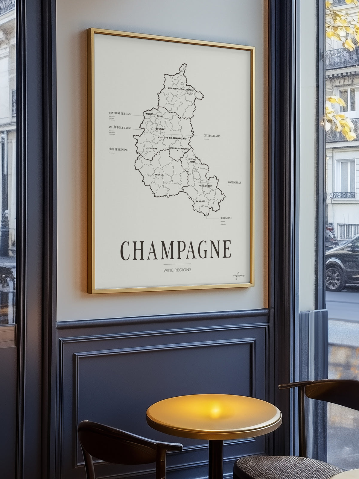
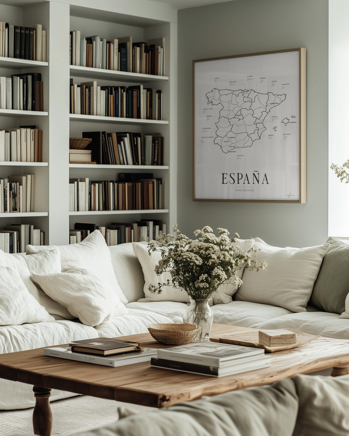
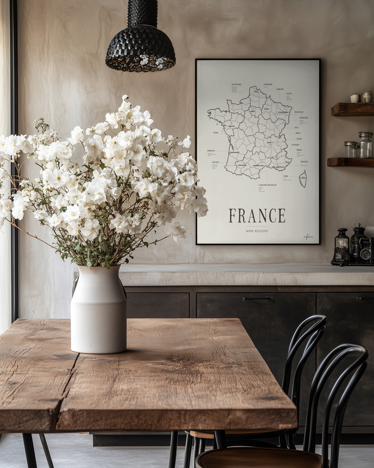
Posters as a Tool for Working with Trends
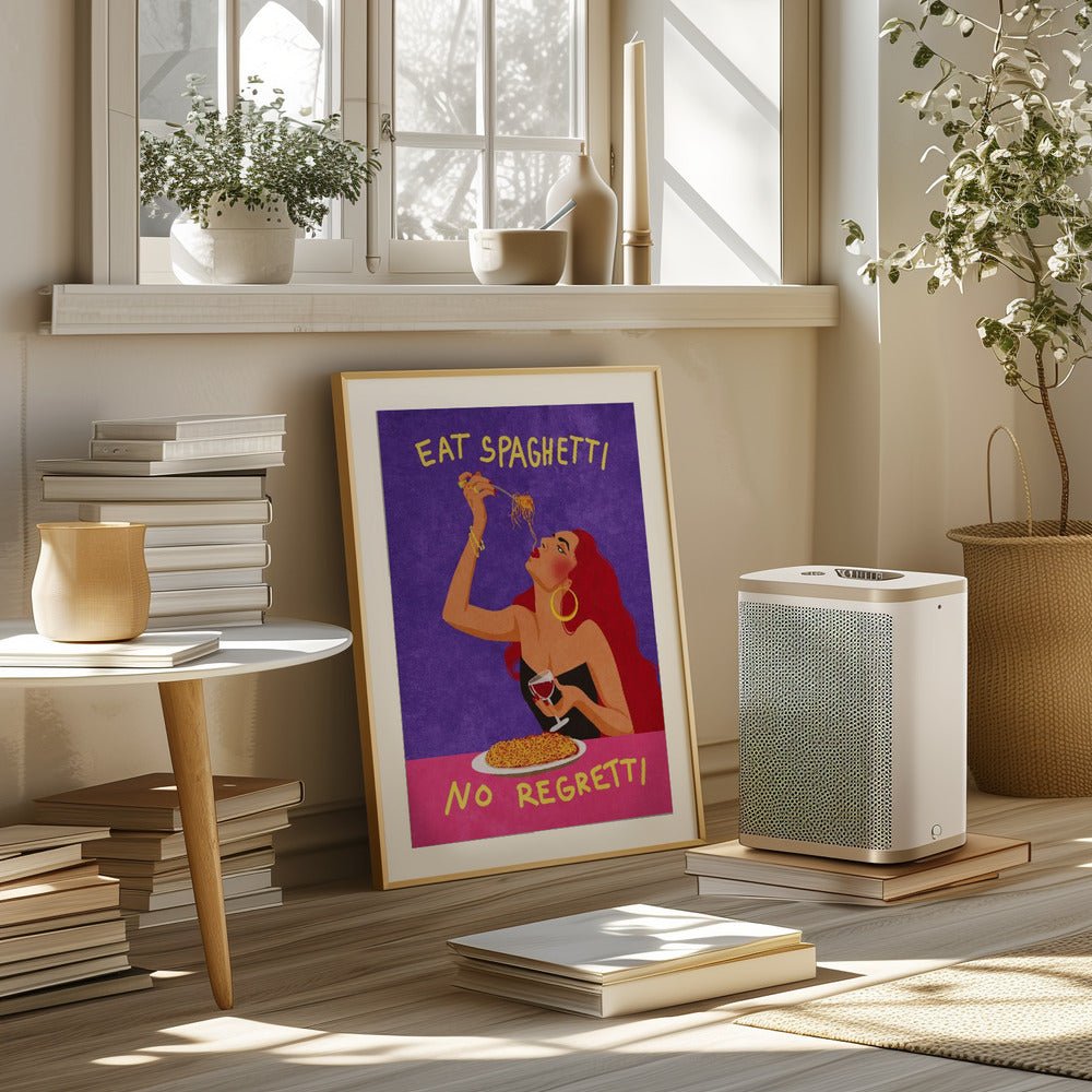
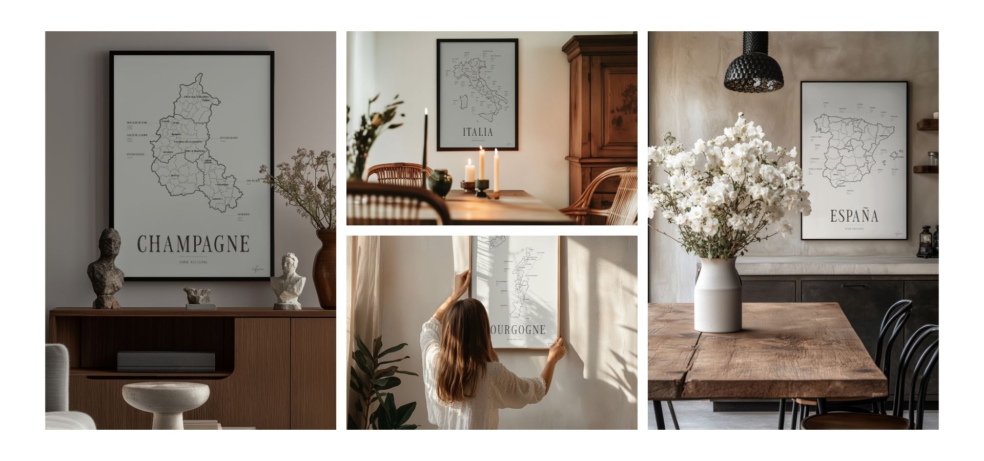
Posters are one of the most flexible ways to introduce color trends into your home. They allow you to work with current palettes without making permanent changes. Through art and graphic prints, color can be added, adjusted or removed as trends and personal preferences evolve.
In 2026, posters are often used to:
• introduce accent colors to neutral spaces
• create depth and focus on calm walls
• connect colors used in textiles and interior details
• build personal gallery walls with a consistent color story
Light Bases and Layered Color
A clear direction for 2026 is working in layers. A light, neutral base creates space and calm, while color is added gradually through art and details. Posters function as an important middle layer, bridging the gap between walls and interior elements.
This approach allows color to feel integrated rather than overwhelming, giving the room flexibility and longevity.
Collections That Reflect the 2026 Color Direction
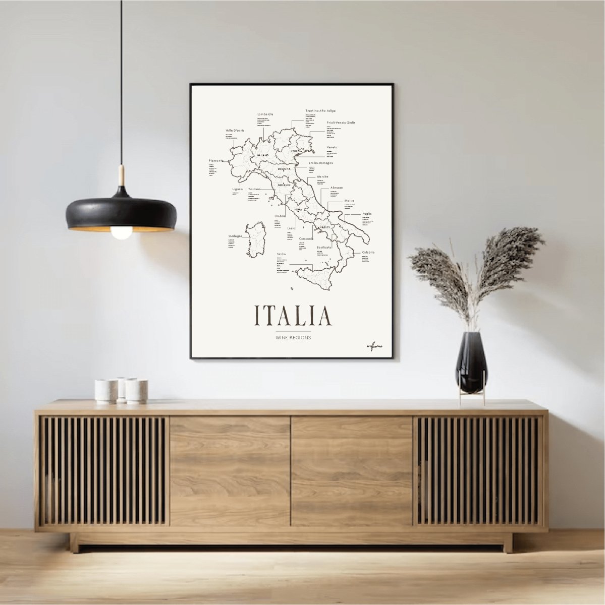
For those looking to build a light and timeless foundation, Soft Light Collection offers posters in gentle, airy tones that work as a neutral base.
To add depth and follow one of the strongest color trends of the year, blue tones can be introduced through Blue Collection, where blue takes center stage as an accent and expressive element.
A Long-Term Approach to Color and Interior Design
The 2026 color trends emphasize sustainability, calm and individuality. Rather than constant change, the focus is on creating interiors that feel considered and adaptable. Posters make it easy to explore new colors, refine your style and update your space while maintaining a timeless foundation.
By combining light bases, carefully chosen accent colors and art that reflects your personal taste, you create interiors that feel current, balanced and built to last.